


CLIENT
Bumble allows users to make new purposeful connections and create meaningful relationships, whether they are looking for a partner, to make new friends, or to expand their professional network
THE BRIEF
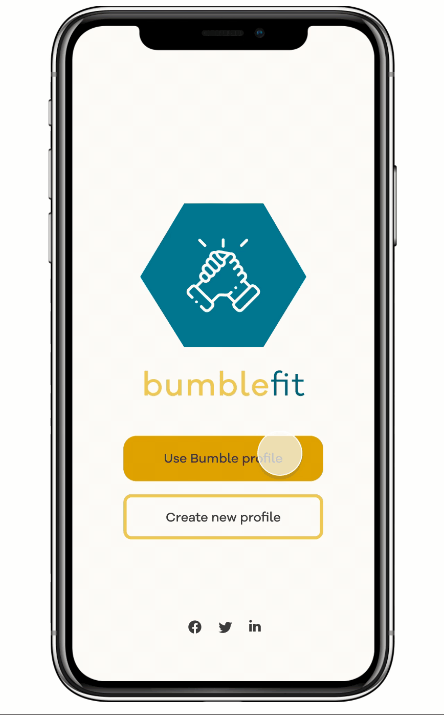
Introduce Bumble-fit, to allow people to find exercise partners.
Should be inspired by the existing bumble interface and what makes it appealing to users.
TOOLS
Figma
Miro
Ilustrator
Photoshop
MY ROLE
Whilst the nature of the project was collaborative, we each conducted a series of usability interviews, user testing and then analysed and aggregated our results.
My role involved overviewing the competitor analysis, project management and leading the digital prototyping process. This involved establishing the design system in Figma for the team while owning the development of all digital iterations on Figma.
My background in design allowed me to easily translate concepts into mock-ups and prototypes and I developed the branding.
PROJECT FEEDBACK
Debbie and the team delivered a professional and well-polished presentation that showcased a clear UX design process based on an understanding of the users. Importantly, they also took into account the wider context of the bumble ecosystem, and delivered a surprising amount of work in a short time!
THE PROCESS
We chose to adopt the double diamond method. This means that we first discover and define the problem we have to solve after we continuously develop, test, and iterate until we have a final product.

READ THE FULL CASE STUDIES ON MEDIUM!
Competitive Analysis, 50 Screener Survey, 15 User Interviews, 6 Usability Testing
Affinity mapping, Persona, Experience map, Feature Prioritisation,
Design studio, Feature Prioritisation, Rapid Prototyping
Ideation and 20 Usability Testing, Visual Design, style guides, and 15 minutes presentation
1. Discover
2. Define
3. Develop
4. Deliver
Byron Fernandes - Lead Instructor
PROBLEM
1
SOLUTION
We created a personalized sign-up process with the goal to match with the right partner and offering a detailed match page where the user can see the common interests.
2
RESULT
We received a lot of positive feedback, users will be willing to try this service and they believe it’ll have a beneficial impact on their life. Users have said it is such a great way to find motivation, stay healthy and expand their network.
3
Bumble wants to expand by offering a service that can help people to find exercise partners inspired by the existing bumble interface and what makes it appealing to users.
DISCOVER
COMPETITIVE ANALYSIS & USER RESEARCH
We tackled the problem by conducting a survey among 50 people whilst doing a competitor analysis. Then from the insights gained we conducted in-depth interviews focusing on the main pain points founded. These are the main findings :
Survey on sports/fitness habits
used Strava
most popular app
54%
35%
exercise to socialise with friends
interested in fitness
71%
80%
exercise at least once a week
like to exercise outdoors
60%

• Connecting profiles with Social Media was a key feature amongst all competitors
• All competitors had a customizable Profile Page
• Route/Activity Recommendation was not featured on many fitness apps
• Offering tailored and bespoke activity suggestions could be a unique feature
COMPETITOR ANALYSIS
COMPETITOR FEATURE AXIS
We established that Bumble-fit was going to move away from competing with other Fitness apps i.e. Garmin, Strava etc. and was instead going to be a Fitness Networking app aimed at amateurs who like to stay in shape
DEFINE
RESEARCH AND INSIGHTS
We used the affinity mapping method to process our interview data. Based on the interview findings, we produced a persona that helped us to define the problem/outcome statement to provide a service that the user could benefit from.
AFFINITY MAPPING + USER INTERVIEWS
• Connecting profiles with Social Media was a key feature amongst all competitors
• All competitors had a customizable Profile Page
• Route/Activity Recommendation was not featured on many fitness apps
• Offering tailored and bespoke activity suggestions could be a unique feature
OUR PRIMARY PERSONA
We used the insights from our user research to create personas for the key user groups. This enabled us to focus our design to meet the key needs of the most prominent user groups.
KATIE - ACCOUNT MANAGER
GOALS
• To keep exercise fun and relaxed (not competitive)
• To exercise with other people in order to stay motivated
FRUSTRATIONS
• Watching YouTube and Instagram videos are uninspiring. Also, they quickly get samey and monotonous.
• I wish I could exercise with my friends but they live far and lead busy lives as well.


USER JOURNEY
We analyzed Katie’s experience her issues we were most interested in were regarding 2 key areas:
-
Pre-plan work out: after she decides to work out she realized that nobody is around because she is new in the city and she has to look for inspiration to decide what she’s going to do.
-
After workout: She doesn’t feel fulfilled after the class
PROBLEM STATEMENT
"Katie needs a way to match with the right person of her desired skill level and interests so that she can be motivated and incentivised to stick to her new, healthy routine"
DEVELOP

.png)
.png)
We then translated our ideas from the design studio into a low fidelity prototype, those are some of the core features that we considered to solve Katie’s problem using Moscow analysis and feature prioritization.
HOW MIGHT WE
During the Design Studio, we focused on solving Katie’s problem by a pre-selected “how might we” that we decided together.
DESIGN STUDIO
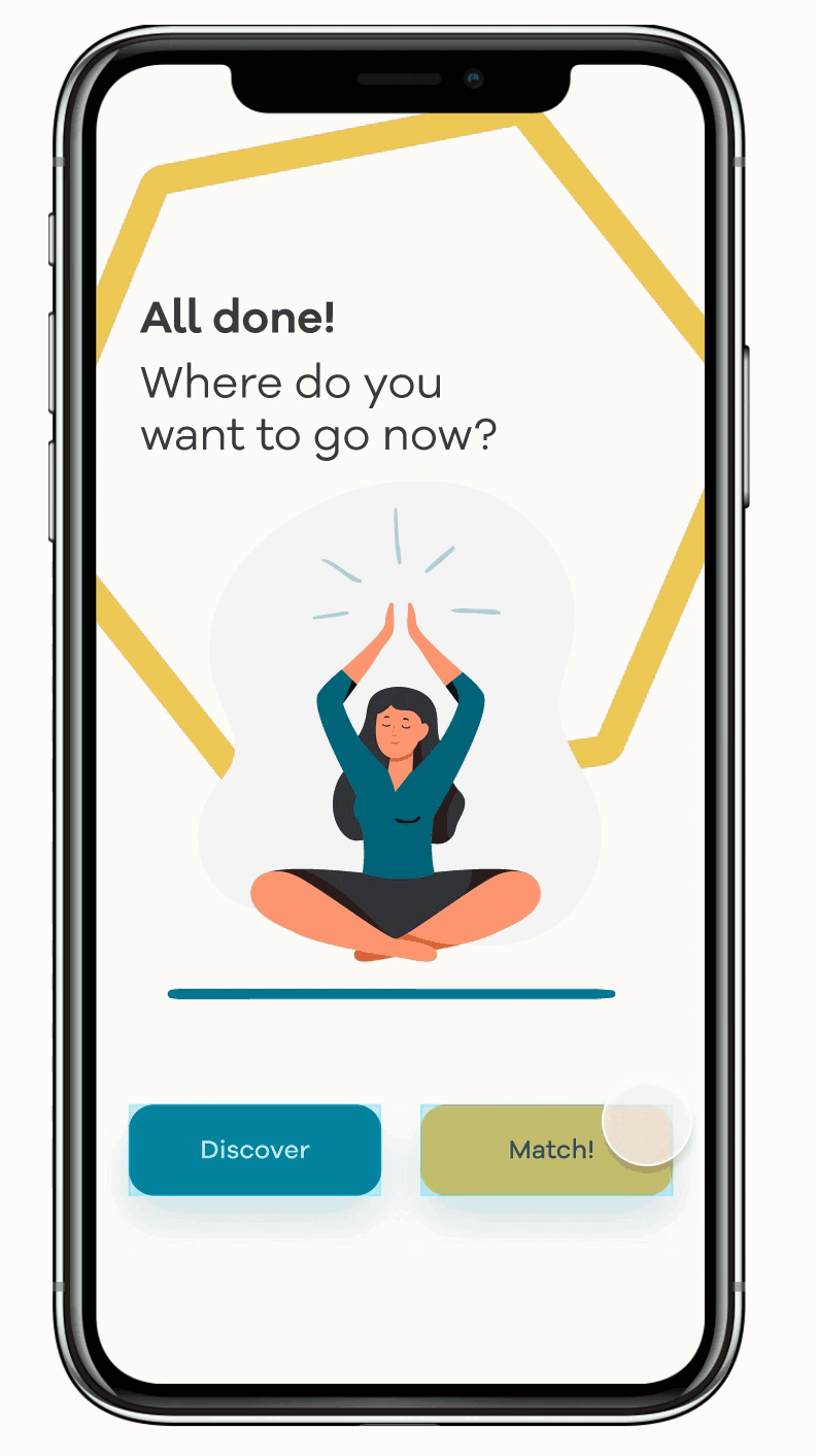
MAIN PAGES
SIGN UP PAGE
MATCH PAGE
DISCOVERY PAGE
SUGGESTION POP UP
WIREFLOW & SCENARIO
As Katie was an existing Bumble user she didn’t have to do the account registration process as her details were already saved.
The flow took into account all the steps Katie needed to take to match with a fitness partner with similar interests.
This included onboarding, sign-up, matching with a fitness partner and then into the chat where they make plans on what activity to do.

DELIVER
PROTOTYPING AND TESTING
We started to conduct user testing throughout each version by taking notes and iterate them according to user feedbacks. The first interaction was on paper after the design studio we tested the prototype with 6 users and then I moved into a digital clickable prototype in Figma.


UPDATED USER FLOW
Once we had completed all the tests we amended the user flow to reflect the updated journey. We then implemented all of the findings into a Hi-Fidelity prototype.
A detailed explanation of findings and solutions on case study

SOLUTION
SIGN UP AREA
We wanted to create a personalized sign-up within the goal to understand the user so we are able to match them with other people with the same fitness interests
-
‘Add sports’ option: users would be more specific with their sporting experience level
-
Comfort Zone area permits the users to set their relative comfort zone
-
Fitness-related prompts
MATCH PAGE
A detailed description of the person and have highlighted the shared exercises interest and the experience level that they have in common
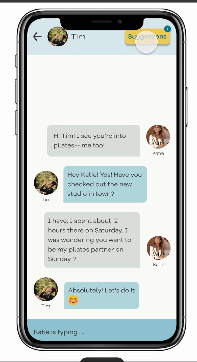
SUGGESTION POP UP
Tailored activities based on the user interests and the person who has matched with
-
Optional ‘suggestions’ button in the chat header
-
Two bespoke activities based on the users shared interests
-
Local groups in the area should they not want to meet 1–1.
VISUAL DESIGN
Bumble’s has already other three products and had their own brand color, we wanted to keep the consistency yet give BumbleFit it’s a unique identity. We choose a blue/green color that reflected an outdoorsy feel to it.

LEARNING
As a team, we worked hard to ensure we utilize our knowledge of the UX process and tools to produce a meaningful solution to a user pain point that leads to business opportunities. I appreciate the chance of working and learning together.
-
You have to be able to justify every decision you take, after the initial mistakes, we started really considering this and at the end, we could have been attacked on every front but we would have had a reply ready.
READ THE FULL CASE STUDIES ON MEDIUM!
