THE BRIEF
I was tasked with creating the visual design of a news mobile application, aimed at children aged 8–10, with content tailored to their level of understanding and reading skills.
TOOLS
Figma
Miro
Ilustrator
Photoshop
The deliverables were :
-
Onboarding
-
Navigation
-
Product display page
-
Article page


TESTIMONIAL
"Debbie went above and beyond with this project, and designed efficiently with a very quick turnaround. She demonstrated an excellent understanding design principles, branding, tone of voice, and interaction. She clearly enjoys visual design! I'd fully recommend her for UI-focused roles"
Kim Habib, Visual Design instructor -
THE PROCESS
I chose to adopt the double diamond method. This means that we first discover and define the problem we have to solve after we continuously develop, test, and iterate until we have a final product.

1. Discover
2. Define
3. Develop
4. Deliver
Defining brand values and identity, brainstorming mapping technique competitor analysis
Visual identity, colours and typography, illustrations and character
Sketching, logo, usability testing on 8 users, high-fidelity UI designs, clickable prototype
10 minute Presentation
DISCOVER
DEFINE BRAND VALUES & IDENTITY
The very first step I took in embarking on this visual design exercise was to attempt to define the brand image for this product.
These were the main key findings :

Fun but not silly
because it is smart fun
Imaginative but not unrealistic
because is adventurous
Learning but not boring
because is educational by doing
Trusted but not restricted
because is safe
Inspiring but not over exciting
because you read about real facts
COMPETITOR ANALYSIS
I conducted a direct competitor analysis based on popular apps that kids love at the moment. Those are the ones that I decided to analyze and get inspiration from and have an idea of where Newkidz will stand in the market.

MY BRAND SHOULD BE :
THE IDEA BEHIND
I aimed to base my app on a learn by playing idea. The concept behind my idea was engaging and to entertain the child by playing an adventure. I created a word map that helped me to explore related topics and ideas and what stood out was the detective (kid) who will have to look for clues (educational games) to solve the mystery (learn something new).
- Colourful
- Engaging
- Educational
- Unique emotional benefit

DEFINE
CREATING A VISUAL IDENTITY
I researched how can be a user interface attract attention and express trust by analyzing the most used apps for kids and what they do.


DESIGN STYLE

Based on my research, the app needed to communicate fun and inspire children and keep that imagination and curiosity going.
-
Black lines simple and genuine
-
Hand made drawing supporting and less dominating, inspired by the kids drawing
-
Abstract shapes help with organizing content by creating structure and clarity, leaving plenty of room for discover-ability and interpretation
-
Bright colors catch children’s attention
-
Buddy fictional character that will help the kid through the tasks
COLOURS & TYPOGRAPHY

All the research resulted in me defining a color palette and typeface and set up a style guide.

Then, I defined the typeface, bearing in mind the necessity to have a clear and simple font.
Gotham Rounded was the chosen font. Serious. Sometimes.

Buddy is a little magnifying glass that will be always read to help your kid out whenever is need it.
FICTIONAL CHARACTER
DEVELOP
SKETCHING WIREFRAMES
The concept idea finally became concrete — visual through the sketching.
PLAY BY LEARNING APPROACH
READ ARTICLES AND FIND MISSING WORDS
DISCOVER TOPICS AND FUN FACTS


DEFINING THE LOGO
Considering the above-mentioned points, I developed the idea of a logo symbol that would reflect the adventure. Also, it had to look fun and simple to immediately connect users to the theme of games.
SOLUTION
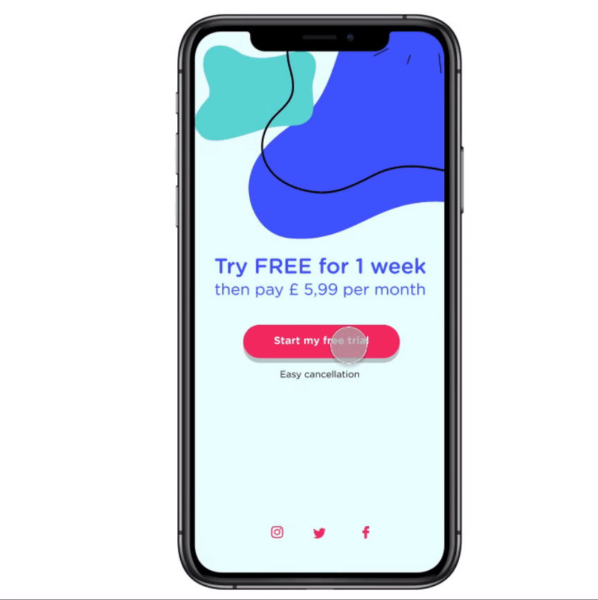
SIGN IN
The main screen allows the parent to sign in and create an account for their child. The idea is to further develop a parent's area, where they can see what the child is learning and practice together, keeping track of the worlds learned, alongside weekly goals.
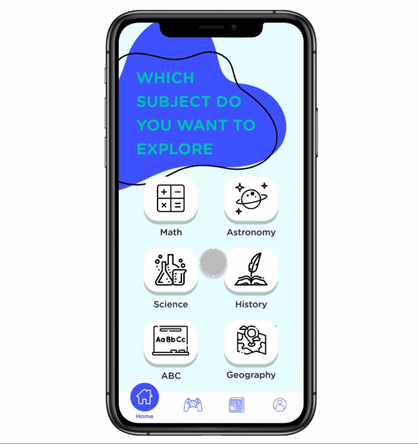
HOMEPAGE & GAME AREA
homepage where the child can see all the subjects that they can interact with and the main screens that show how different articles
VISUAL DESIGN
The design system used
Read the full case of study on medium


LEARNING
I really enjoyed the visual design process, as it was fun and interesting. Especially to be able to develop a product in an informal learning environment for children, backed up by a theoretical notion of play as a core activity in a child’s development.
READ THE FULL CASE STUDIES ON MEDIUM!
